Today, as the rain pours outside, I’m lounging at home, reflecting on some of the recent photographs I’ve seen. A few common mistakes in composition come to mind. Are you making any of these errors? If so, they might be holding your images back from reaching their full potential. Discover these mistakes and learn how to avoid them in your future compositions.

(A hilly landscape in monsoons)
Too Small A Subject!
I often come across images with a fantastic subject, but the subject tends to get lost within the overall composition. The issue lies in what the photographer sees in front of them, rather than what’s visible through the viewfinder. When an interesting scene unfolds, we tend to focus on the main subject with our eyes, neglecting the surroundings. The same happens when we look through the camera—the subject that captivates us takes center stage, but we forget about the excessive space around it. This leaves the subject too small in the frame.
There’s a simple solution to avoid this: get closer. As one photographer famously said, “If your photograph isn’t strong enough, you’re not close enough.”
Before pressing the shutter, observe the subject within the entire frame. While cropping can always be done later, why rely on it if you can compose your shot better from the start? Move closer, use a longer focal length, and make the subject fill the frame. Let it dominate the image!

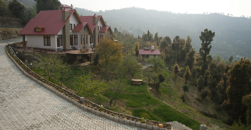
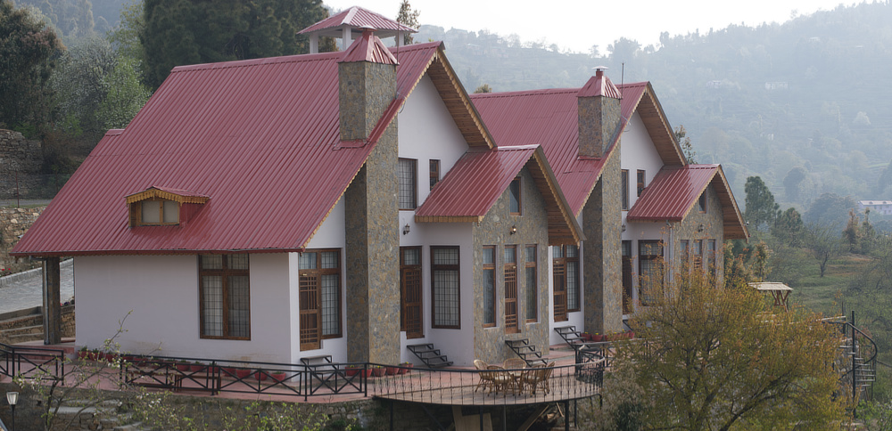
(The photograph above was captured using a 25mm lens and the one below was captured using a 50mm lens. The main subject was cottage. The above photograph has landscape and a pathway leading to the cottage, the one below brings out the beauty of the cottages better. Each photograph serves a different purpose.)

Mistake 2 – Too Many Unnecessary Elements
This mistake is similar to the first but with a bit more impact. Here, the subject isn’t just lost due to its size but because unnecessary elements clutter the composition, creating distractions instead of adding value.
A famous photographer once said, “Anything that doesn’t add to a photograph takes something away from it.” I’ve quoted this many times, and it’s still worth repeating!
Keep your compositions simple. The main subject should stand out, and every element in the frame should have a purpose. If it doesn’t contribute meaningfully, it’s just a distraction.
Take another look at the photographs above. In the first, not only are the cottages smaller, but the garden in front also distracts from them. While both images serve different purposes and have their strengths, the second one does a better job of highlighting the building.
Distracting Background or Foreground
Just as certain elements in a photograph can be distracting, the foreground or background can also compete for attention. While a shallow depth of field can help, even blurred distractions in the background can still detract from the image. Aim to position your subjects in a way that both the foreground and background complement the composition, rather than distract from it.

(Though the bird is sitting on an apple and seems to be enjoying it, the cluttered foreground and background creates tension in the overall composition. In contrast, the photograph below focuses just on the bird)

(Without the distracting foreground and the background, the bird stands out.)
Blurred Main Subject
We live in the age of autofocus, and have for decades, yet it’s surprising how often mistakes are still made with this convenience. It’s common to see photos where something next to the subject is in focus, but not the subject itself. I’ve seen portraits where the ears are sharp but the eyes are slightly out of focus. Similarly, in bird photography, I’ve seen skilled photographers end up with a sharp tail but a blurred head. To avoid this, I recommend switching to back-button autofocus if your camera supports it. Press the shutter only when you’re confident in both your composition and focus.
Two common technical errors can also cause focus issues. First, you might accidentally switch the autofocus lever to manual. This happened to me once while birding with a friend at Natadol. At first, I thought my diopter setting was off, then I blamed a dirty viewfinder, only to realize after two shots that my autofocus wasn’t working! The second mistake is when your autofocus mode is set to continuous or tracking. In this mode, changing the framing shifts the focus. If your main subject is out of focus, quickly check these two settings.
If the entire frame is blurred, the most likely culprit is camera movement. Increase the shutter speed, use a tripod or support, enable image stabilization (VR), or raise the ISO. Whatever you do, avoid capturing images that show motion blur from hand shake. In fact, a noisy image from high ISO is often preferable to a blurred one.
Placement of the Subject
Placing the subject in the dead center of a frame is often discouraged by many photographers. They’ve developed guidelines like the Rule of Thirds, the Fibonacci Spiral, and the Golden Ratio to help create more dynamic compositions. To some extent, I agree with these principles. The subject should be positioned in a way that adds interest and balance to the composition, including the negative space.
That said, I’m someone who considers these rules a bit restrictive at heart, but I still share them with others. Ultimately, it’s up to you whether to follow these guidelines or not.
My advice: experiment with placing the subject in different parts of the frame at first. Choose the position that feels most powerful. With time and practice, you’ll start doing this instinctively.
A helpful trick to improve subject placement is to use a prime lens for a few months. This will enhance your overall visualization skills and help you better position elements within your composition.

(A tight composition without following any rules.)
Missing Main Element
Often, a scene captivates us for reasons beyond just what we see. Imagine standing on a hilltop, taking in the view while a cool breeze brushes your face, birds chirp around you, the scent of flowers fills the air, and you’re filled with joy, perhaps after completing a tough project or receiving a promotion. The beauty of the scene is heightened for you by everything you’re experiencing in that moment. But the photograph? It lacks all those sensations and emotions, often resulting in a mediocre image for most viewers.
Your challenge is to convey that feeling through your photograph. Capture the elements that make the scene special to you. Include the flowers to suggest their fragrance, or perhaps a smiling portrait of yourself to reflect your happiness. Instead of just a wide landscape, consider adding a focal point that engages the viewer.
One mistake to avoid is creating an image with no clear point of interest. Without something to hold the viewer’s attention, the photograph loses impact.
My trick in such moments is simple: analyze what moved you about the scene and focus on showcasing that, rather than just recording what’s in front of you. And always include a focal point!
Be careful, though, not to overwhelm the composition with multiple focal points. Most of the time, a single focal point works best.

(Just a Winter Landscape. Sometimes sitting inside on a sultry rainy day with no chance of going out, makes me miss the cool winter landscapes. Uncomfortably cold and yet beautiful! This is just a spacer, nothing to do with the main article)
Silly Mistakes
These are mistakes that can easily be avoided. (I call them “silly mistakes” because that’s what I used to make in math during my school days, and my mother coined this name for them.)
Simple oversights often cause these errors: a tilted horizon, an electricity pole awkwardly sticking out from behind your subject’s head in a portrait, contradictory elements (like a stack of garbage when capturing a beautiful seashore), photobombs, power lines running through a magical landscape, or accidental blinks or odd expressions in portraits. Avoid these by taking a moment to recompose the shot and clicking again.
Fortunately, you have the luxury of a preview screen. Use it to analyze the scene and catch these mistakes before they spoil your image.
Not Working the Scene
Just because the scene in front of you looks wonderful doesn’t mean you should immediately start clicking away. Take time to move around and explore the scene. This is often referred to as “working the scene.” Try different viewpoints and camera angles to find more powerful ways to capture the moment, rather than just shooting from where you first saw it.
Sometimes those “straight-on” captures from your initial perspective can look awkward as photographs. Shots of kids and pets taken from a high viewpoint are classic examples of this.
Photographers even have a term for poorly composed images when you don’t take the time to move around—they call them “lazy compositions.” Avoid them at all costs. Walk around, try different angles, and truly work the scene!

(The hill-top lit by sun impressed me initially. However instead of zooming in on that, I preferred to place it in front of the tall mountains in the background. The dramatic effect of the ‘spot-lighted’ small hill against the backdrop of the tall mountains looks wonderful)
This article, originally published on my photography site, is now archived here; while some details may have lost their original context over time, it still offers an intriguing read.
Complete list of archived content – Photography Articles
Discover more from Maini's Hill Cottages
Subscribe to get the latest posts sent to your email.
